I would like to announce the 100% Un-Official Princeton Theological Seminary Logo Redesign Contest. [Digg Here]
But first, an apparently necessary legal disclaimer: “This 100% Un-Official Contest is just what the name says – it is in no way affiliated with Princeton Theological Seminary, and completely un-official. It is simply for fun. Designers retain all rights to their works, and it will not be used at any time in the future by Princeton Theological Seminary or its affiliates, unless otherwise agreed to by the designer and Princeton Theological Seminary. The only place that your design will be posted, when you send it to me, will be on this blog.”
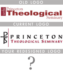 This contest, as you might guess from its name, is not connected at all with Princeton Seminary and is just something I thought would be a fun challenge for anyone who might want to participate. But first, some history. Princeton Seminary (PTS) had the same web-design for a very long time, and was only changed recently when Iain Torrance became our new Seminary President. While it’s not a bad site, it does have a peculiar resemblance to the University of Aberdeen site. Just over a year ago, the seminary redesigned their logo, and I thought it wasn’t a very good redesign. I still think that. There are many things I don’t quite understand about the redesign.
- The fonts simply do not look clean or crisp. It’s probably the drop shadow on “Theological Seminary” that I find the most annoying.
- Our previous logo clearly had an emphasis on “Theological” – now it’s clearly “Princeton.” What is our identity? Is this just another way to try to become more closely aligned with Princeton University?
- I cannot, for the LIFE of me, figure out what the red line is supposed to do in the design. It is just horrible. Is it supposed to be separating the icon image from the text? Perhaps, but it looks like someone just slapped it on at the very last second. There are many more ways to help create visual separation, and that red line is not one of them.
Realize, this is not an attack on Princeton as an institution, or whoever created the logo. The seminary actually has some very talented graphic designers who create some really well-designed event posters (posters for 2006-2007 events can be viewed here). But this logo is not good brand identity or logo design. Thus, the contest.
The Challenge
Your challenge is to redesign the Princeton Theological Seminary logo. I’m sure they won’t actually use your redesign, although I’m sure that someone from the seminary will find this post and who knows – maybe you’ll be famous. The only requirement is that you either use the existing PTS/cross-logo thing or create a new variation on it. But I hope that you’ll consider entering the challenge. Go look around the seminary website, try to get a feel for the mission of the school, and pretend like you were hired by the seminary to create the new logo.
Submissions and Deadline
I will be taking submissions from today until the deadline, April 9th. On April 10th 12th (I had to push this date back because I am going on vacation and my computer is getting shipped to Apple for a little tender-loving-care and I won’t get it back until the 11th), I will post the submissions I have received and readers will be able to vote on them. I will then post the winners and their entries on April 18th. Please email your submissions to cleave at gmail dot com, in whatever format you desire (.gif/.jpg/.png/.ai) as I have Adobe Photoshop CS2 and Illustrator CS and can open most image files.
Judges & The Prizes
The winning entries will be selected by a panel of judges including myself, a PTS student and a professional graphic designer. The People’s Choice Award will be voted on by readers of the blog. The prizes will be as follows:
First Place: $30 Amazon Gift Card
Second Place: $20 iTunes Gift Card
People’s Choice Award: $10 iTunes Gift Card
Best of luck to you all – and remember – please spread the word about this contest. The more people who know about it, the better the contest will be.
UPDATE: I just ran across some information on the Princeton Theological Seminary logo, and if you are working on a design, I think you’ll want to read this. First, a History of the seminary’s logos and seals. Second, some basic information behind the design choices for the current new logo. And last, some acceptable and unacceptable uses of the logo. Enjoy and happy designing.